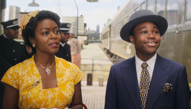
“My little Venn diagram is story, authenticity, and visual content,” says production designer Curt Beech. “And I’m trying to find the middle of those three things.” For “Till,” Chinonye Chukwu’s historical drama about Mamie Till-Mobley, who channeled her grief over her son Emmett Till’s 1955 lynching into a fight for justice, that meant doing extensive research.
How do you approach projects like “Till” that deal with historical events?
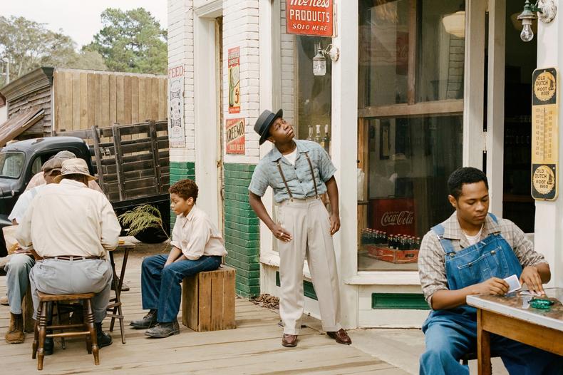
It’s most important to start with research. We looked at every picture we could possibly find. Newsreels were increasing in number at that time, and there are a few really good ones that show Money, Mississippi, [where Till was murdered]. There are a couple that show pieces of the inside of Bryant’s [Grocery] store. We had the FBI report; we had all of these things to draw on. Then you get into the reality of making a film, and that’s where the decisions have to be made. What do you keep? What of this is absolutely essential to tell the story, and what do you adapt in order to tell the story in a more effective way for the audience?
And then you have all the constraints of the actual production process. We built nothing on this film—everything we did was in a location. In a way, it freed us, because we were able to find places that had the spirit of what these places were historically without having to get every single detail absolutely, documentarily correct. [This film] isn’t a re-creation of events; it’s the story of a mother’s courage and decisions that she makes that affect an entire generation of people after her. So you have to figure out how you’re going to use these things that you’ve learned, and what you’re going to do with them.
How did you keep track of all that information?
One of the first things I had construction do was build bulletin boards, and we put the whole film up chronologically, so that anyone [could] walk through and understand what we were researching. It’s very important in a film like this to get the graphics correct. We have amazing graphic designers who understand the period very well. Bad graphics can kill a movie, but good ones sort of disappear, you know?
RELATED: Why Production Design Is So Important in Film
Were there elements you thought came together especially well?
I’m very proud of how it all came out. But in this case, where I think we succeeded is that the production design is unobtrusive but appropriate and authentic. It tends to fade into the background, because it’s not about that. I always say that in doing a comedy, scenery isn’t funny. Scenery is also not dramatic. Scenery should not do anything except serve the story. And I think we served the story really, really well.
What advice would you give to aspiring or early career production designers?
I teach the production design class [at NYU]. What I will tell [my students] is: Gently stalk the people that you want to work with and get a meeting. Sit down with them and find out what it’s going to take to get from point A to point B. It’s how I got my first job, and it’s how almost everyone gets their first job. There’s no LinkedIn for this kind of stuff. It’s only through talking to people and having them see your work and getting them to know how serious you are about wanting to do this; that’s the path. There’s no other path.
 Credit: Andre D. Wagner
I’m curious about the conversations that you had with Chukwu and other members of the creative team. How did your work impact and inform each other’s?
With Chinonye, we were talking constantly about the choices we were making and what you would expect to see on the day that we got there. There were some tricky elements. Very early on, the first thing we did was a model of the train station. We shot it at a train museum in Georgia—this was all in Atlanta. The intricacies of where the trains were going to be, how they pulled into the station, what the station actually looked like, and how we were going to marry these things—all these decisions have ramifications and have to be vetted with the director, and she has to feel comfortable and know what she can and can’t do on the day with Bobby [Bukowski], the cinematographer, as well. So we’re constantly checking in with each other.
The color discussion was interesting, too, because we landed on color restriction early on. Sometimes you’re telling a whole color story with very specific rules. But on this one, we left it open except for the color yellow, which we restricted to the color of joy. And joy is very important in this film. It’s how Chinonye approached this whole project—it has to begin and end in a place of joy. It begins in Emmett’s room, which is an explosion of this yellow color, and it ends in the same place. It’s good to have these rules and restrictions going into something like this, because then it makes your other decisions easier as you go through.
 How to Become a Production Designer for Film, TV, and Theater
 Is there a project, whether early in your career or something more recent, that really cemented why you love the work you do?
I think I would pick [2009’s] “Star Trek.” It had been tried quite a bit, but the way that J.J. Abrams was bringing it back was very different; we were all working together on trying to create this new version.One of the fun things about doing science fiction is that there’s lots of invention, because the rules are different. You’re creating story from the sets, but you get to make up much more of it when you’re doing science fiction, because the history and the way things are built and the way people live is often open to interpretation. We had a great game that we would play as art directors on that film: We would challenge each other to find the most obscure, strange things in the dumpsters around the Paramount lot and try to work them into the set somehow. It just shows that you can make anything into anything else. It got my creative juices flowing, got me thinking about things in a different way.
You also won an Emmy for your work on “Only Murders in the Building.” What was that show like to work on?
This one starts more from the character than from research. Each of the sets started with a key element. In Oliver’s [Martin Short] apartment, we had this idea of having a stage in his apartment. It opened up a whole vocabulary for his place. If it wasn’t dramatic, it didn’t stay. If it wasn’t theatrical, we banished it.
For Steve Martin’s place, for Charles, it came from a lot of discussions with [series co-creator John Hoffman]. I had done a completely different version of this set that was ripped from ’90s Architectural Digest—New York bachelor apartments. We put it up on the boards and we looked at it, and it just kind of made everyone sad. So we tossed the whole thing; that was part of my pitch book that got me the gig, which I haven’t really had happen very much in the past. I was really mad for like, half an hour, and then I was like, I’ve got to figure this out.
So we came up with this idea of playful sophistication. We found this little swatch of fabric from Paul Smith that was eventually his sofa—it was just the thing for him, and that one piece gave us a tonal color palette. It gave us the license to do some crazy things, more colorful things, more adventurous things with his place, but keep it very sophisticated.
And then Mabel’s [Selena Gomez] apartment is not hers. So we had to determine, whose was it? What had been happening in that apartment, and how is she possibly going to live there? That was a different thing entirely. The big thing was opening up that wall to try to get more depth in the apartment. Initially, I didn’t want to do it. I was like, This is crazy. Can I really just open this whole wall up? And then when we did it, I thought, Oh, sure. This is great. It’s perfect.
This story originally appeared in the Nov. 17 issue of Backstage Magazine.