When I first expanded my craft to include photographing actors, I quickly noticed that when it came to wardrobe, there were two types of clients: The “Oh my god, I have no idea what to wear, I have no idea what to bring, HELP!” client and the “It’s not important, I’m bringing my two favorite shirts” client.
The good news for client #1 is that there’s a specific, smart way to pack based on your goals and features. Client #2, I’ve got some bad news for you: no successful professional on earth takes that relaxed of an approach to their marketing materials—it’s a recipe for failure.
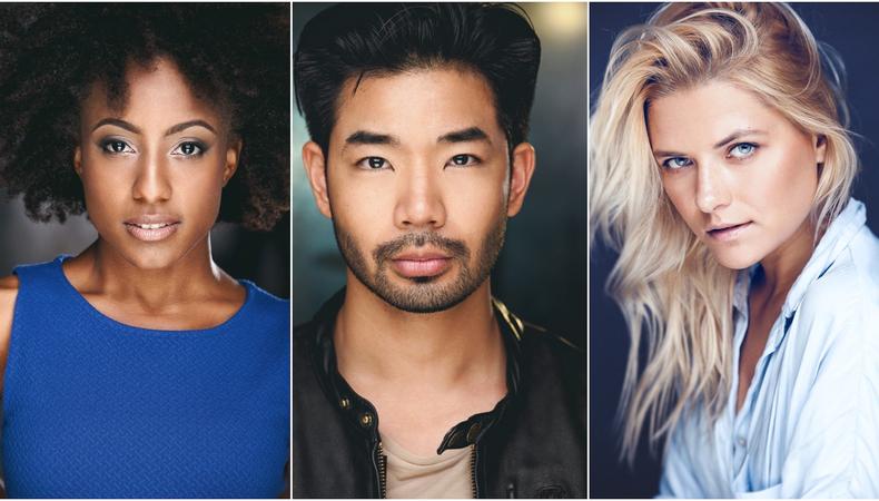
A great headshot is not just a photo of your head. When done right, it gets you noticed and communicates honestly and instantly with casting to blast doors open for you. And one of the biggest factors in a great headshot that gets you noticed by casting vs. one that remains in the “no” pile is color scheme. Not only does a winning headshot color scheme help you get noticed and appear more interesting simply by existing in a more visually stimulating frame, but it also helps you communicate comprehensively with casting directors seeking your type.
The best way to showcase something is to surround it with its opposite color. So before choosing your wardrobe consider the color wheel. The color directly across from another is it’s opposite. Blues are opposite yellow, purples/magentas are opposite greens, reds are opposite cyan. When opposites are seen together, their conflict generates dramatic value. Sunsets are dramatic because blues are suddenly splashed with warm tones, and purples and pinks might be speckled with a green tree line. So if you ever caught yourself mesmerized, unable to look away from a sunset, imagine what smart color contrast can do for your headshot.
Below are a few tips on how to leverage and harness color to create potent marketing materials.
1. Mix cool and warm hues.
Most people have warm tones in their skin and hair, so blues and other cool hues are almost always an option when it comes to contrast.
READ: Headshots: Everything You Need to Know
When a client with blue eyes wears blue, people mistakenly say the blue garment is bringing out the blue eyes. But that’s like saying white brings out white. The reality is that the warm skin tones contrasting with the blue eyes bring out the blue in the eyes. Meanwhile, the blue shirt just stays out of the way, whereas a purple shirt would add a color for the viewer’s eye to digest—instead of your face.
Similarly, if you have olive skin and/or green eyes, bring some purples/magentas and greens with you to lend contrast and visual interest to the frame.
2. More is not always better.
Just because color contrast creates a stimulating frame doesn’t mean the more contrast the merrier; color omission is a big part of a winning color scheme. Color carries associations for the viewer. Too many conflicting colors render an image busy, sometimes making the viewer unconsciously uneasy or detracting from their ability to take in the actor’s essence and expression.
To make sure you’re able to give your headshot’s color scheme the necessary restraint, pack some neutral tones (blacks, grays, whites/cream) for every look. Make sure you have neutral tones as key wardrobe and undershirts. This way, if you notice your background provides your headshot with the necessary color contrast, you’re able to make the adjustment that will allow your expressions to speak.
3. Read the shot.
Depending on your goal with each headshot, the hues will vary. There are exceptions, but generally, keep any theatrical shot relatively dusty and commercial/comedic shots vibrant.
4. Recognize the difference between hue and tone.
So far, we’ve mainly discussed color hues but there is also color tone or the brightness level of a color. And varying tones in an image is as important as varying hues. For example, consider a fair-skinned actor in a commercial shot. Since commercial shots should have a bright mood and therefore often a bright, high-key background, an actor with fair skin in a bright shirt in such a setting could come off as washed out. The image would be flat because there would be no built-in tonal-contrast: the shirt, skin, and background are all bright! Meanwhile, a darker plaid will break the image up. Despite it being a commercial shot, a darker, dustier shirt may be ideal for certain actors.
Once you’ve booked the job, wardrobe and a professional stylist will be on hand to make sure everything looks right and pops the way it’s supposed to. But when it comes to your headshot, it’s your job to come prepared with the colors, tones, hues and contrasts that work best for you and your coloring. Get it right, and you’ll be heading from casting in no time.
Check out Backstage’s TV audition listings!
The views expressed in this article are solely that of the individual(s) providing them,
and do not necessarily reflect the opinions of Backstage or its staff.